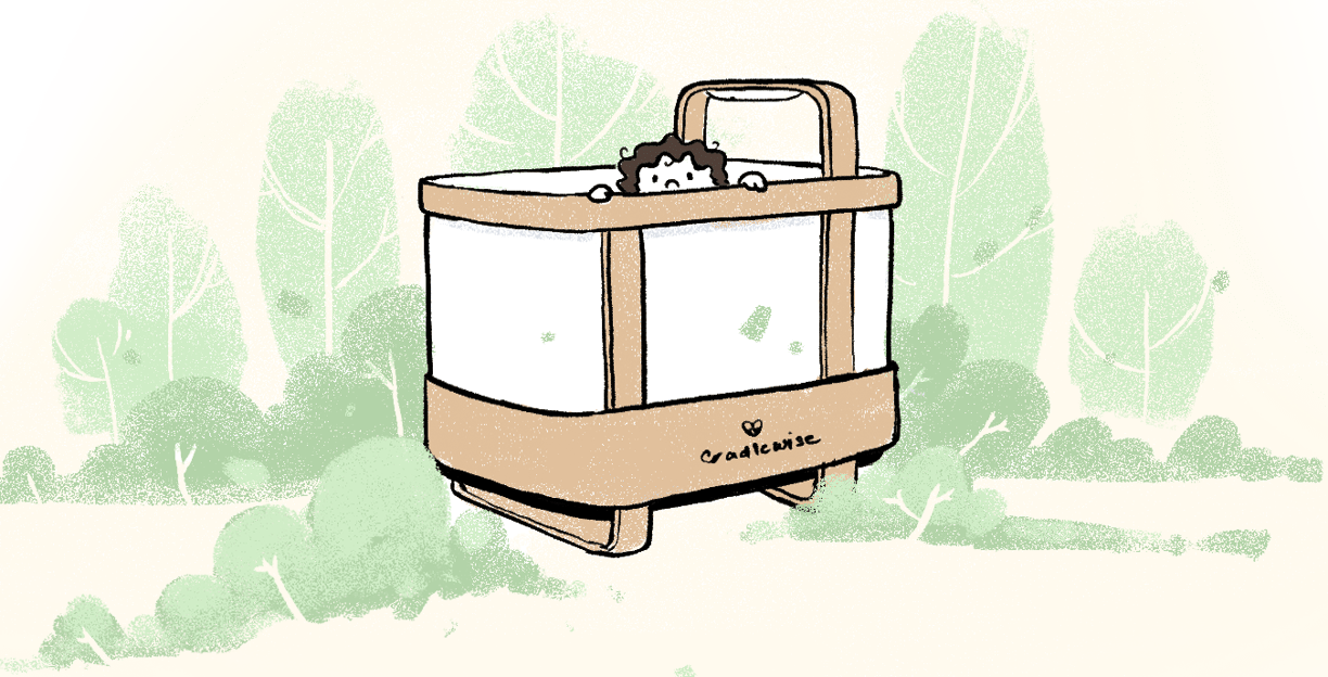
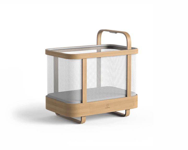
Cradlewise
DESIGNING FOR SLEEP FITNESS
3 Years
Overview
Cradlewise is a smart crib designed for newborns (0-24 months) that gently rocks and plays soothing sounds to help them fall back asleep, promoting longer stretches of restful sleep for both babies and parents. This smart crib detects when a baby is stirring using a built-in 3D image mapping camera and motion/audio-detecting sensors. Based on the baby's sleep state, the crib starts bouncing and playing white noise, emulating a parent's gentle bounce and the sounds of the womb.
Background
Cradlewise is a Bangalore and San Francisco, US-based sleep fitness company for parents and babies that makes intelligent baby cribs. Learn more about Cradlewise here.
My Role
As Cradlewise's first design hire within a 10-person team, I was immediately immersed in shaping the user experience from the ground up. The initial challenge was to refine and expand upon the existing app design crafted by an external UX designer. Upon launch of the MVP app and crib, we began to get real user insights that ultimately shaped the direction I took the redesign in.
// Joining Cradlewise early gave me a unique opportunity to shape the design direction. A key insight was recognizing that the parent was the primary user, not the baby. This shifted my focus to creating a functional yet emotionally supportive experience. Seeing the positive impact on parents reinforced the importance of user-centered design in every decision.
// My thought process and reflections will be in this format.
User Research, Interaction, Visual design, Prototyping & Testing
Tasked with enhancing the app for sleep-deprived parents during a period of rapid company growth and the COVID-19 pandemic, I collaborated closely with the product and engineering teams to implement key features such as sleep alerts, detailed analytics, customizable sleep tracks and a dark mode. I also established the app's design system to ensure consistency and scalability as the product evolved.
Duration: April 2020 - August 2023
The Challenge
Stressed & Overwhelmed: Designing for sleep-deprived, fatigued parents who often lack adequate support.
Understanding User Needs
Information Overload: Helping parents navigate an overwhelming amount of conflicting advice.
Need for Complementary Support: Ensuring the product aids parents within their current socio-cultural context, not replacing essential parental care.
Navigating Business Realities
Learning UX on the Fly: Transitioning from visual design to user research and advocacy.
Convincing Stakeholders: Continuously promoting user-centered design in an agile startup.
Global Collaboration: Coordinating design remotely across different cultural contexts (USA market, India-based design).
Rapid Iteration: Balancing speed with thoughtful UX solutions.
Combating the "Robot Nanny" Perception: Positioning the product as a supportive tool rather than a replacement for parental connection.
Design Process
Few quick and dirty research methods we would use when primary research wasn’t feasible amidst a pandemic:
// As we launched with our first customers, and the pandemic restrictions started easing, we started gaining direct feedback from parents. I participated in and drew insights from user interviews. I was joined with more design team members towards the end of 2021, and with our combined advocacy, we could push the company for even more active and continuous user research across different design and development domains.
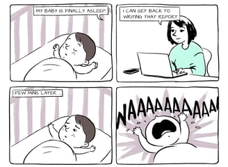
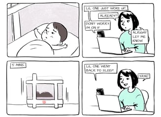
Without Cradlewise
Quick and Dirty User Research
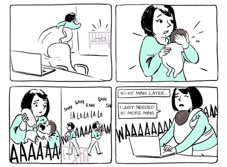
With Cradlewise

Empathy Tools: Imagining how parents would interact with the crib and app while caring for newborns.
Internal Expertise: Leveraging the experience of American employees who were parents themselves to understand their environmental context.
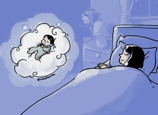
Paren(t)hesis Web-Comic: Ethnographic insights from parent-centered web-comic series I worked on for marketing, which helped develop key character profiles representing archetypal parental behaviors.
Customer Support Queries: Analyzing frequently asked questions and pain points.
Competitor Analysis: Studying other baby products, parenting, and wellness apps.
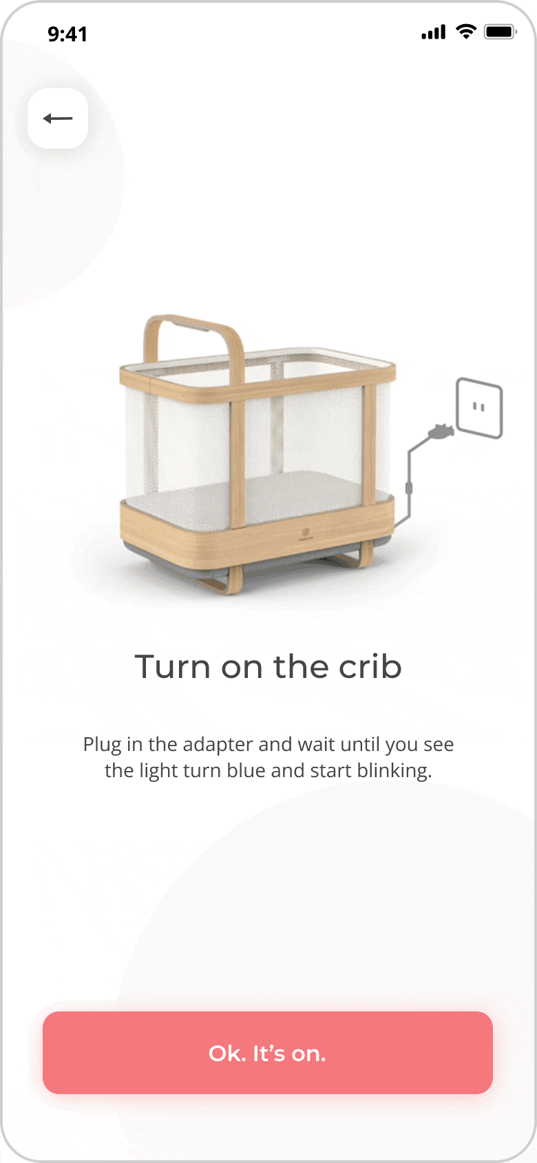
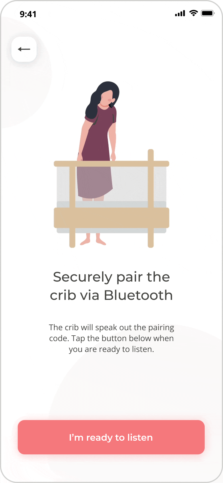
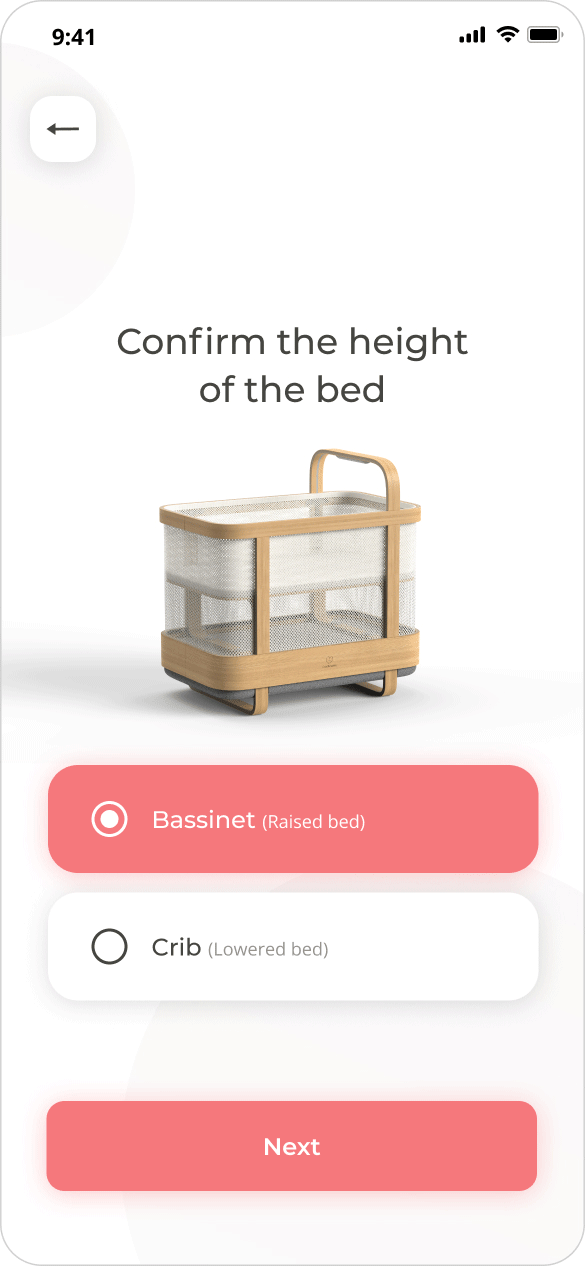
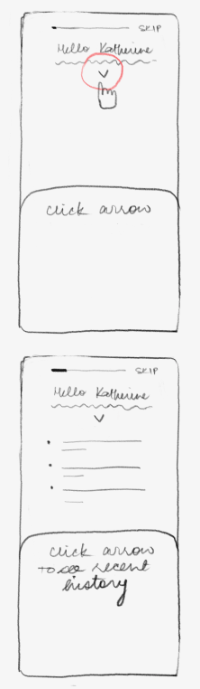
Onboarding
Problem: Many parents struggled with the initial setup of the crib.
// I also included these instructions in the user manual for consistency and easy access.
Key Features & Design Solutions:
How I Handled Different Design Problems
Solution: We added visual, step-by-step instructions with animations in the app, which reduced customer complaints and lightened the load on the customer success team.

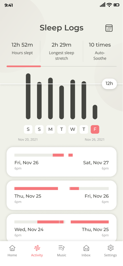
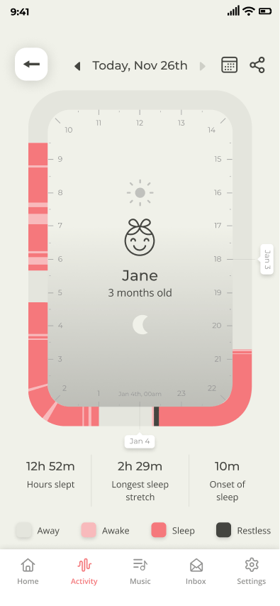
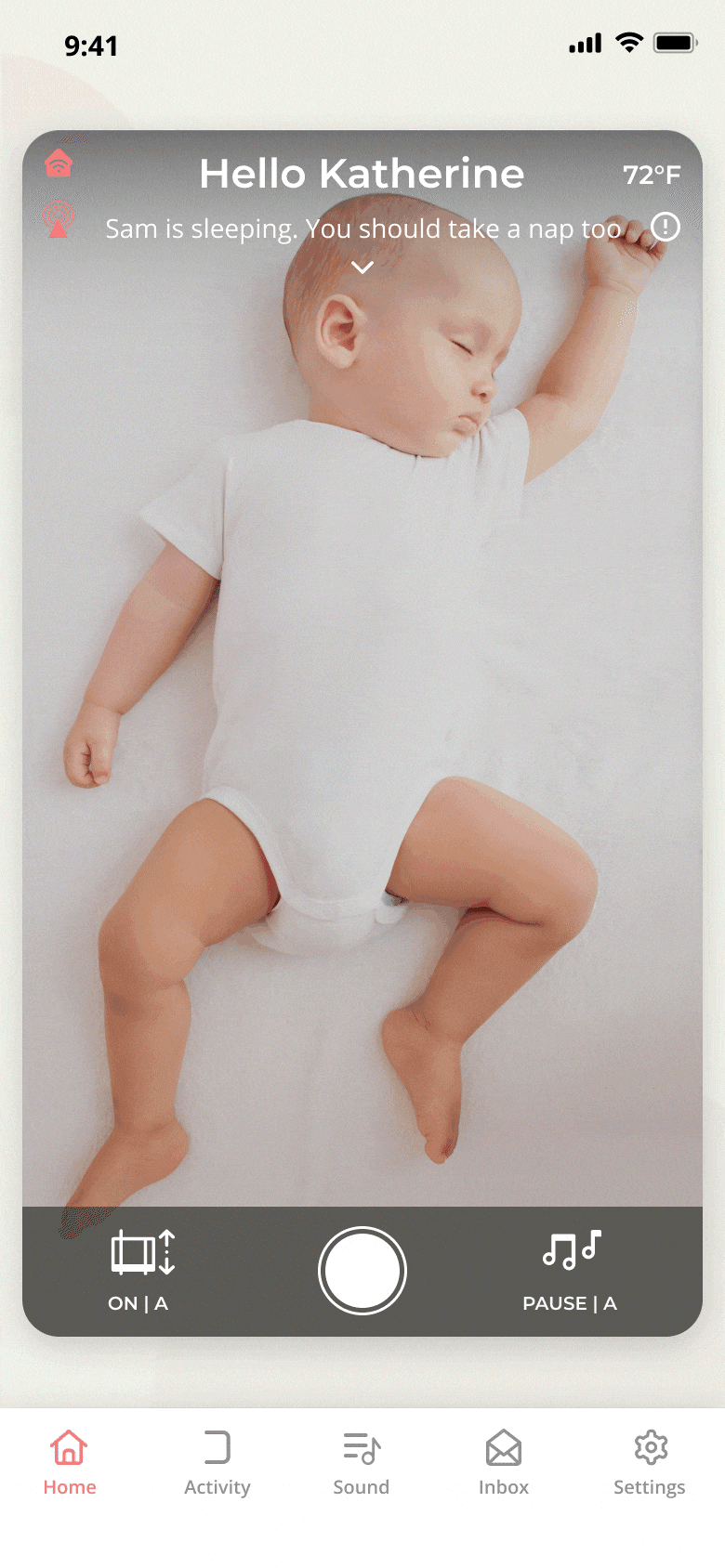
Dashboard
Problem: The initial dashboard had a small video preview and lacked at-a-glance information.
// The status message included a report option for parents to flag discrepancies, which was invaluable for training our AI model to recognize sleep stages more accurately.
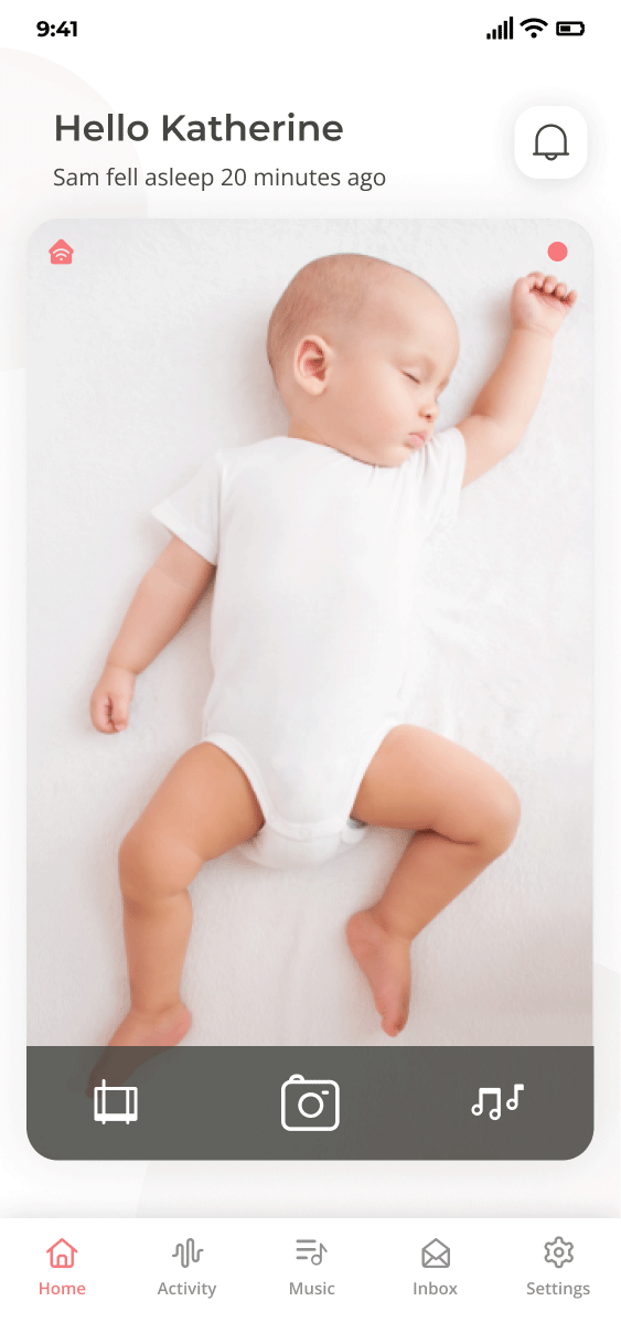
Solution: I redesigned it to display the baby’s sleep status clearly and streamlined icon buttons for better usability.

Earlier version
Sketches
Final design
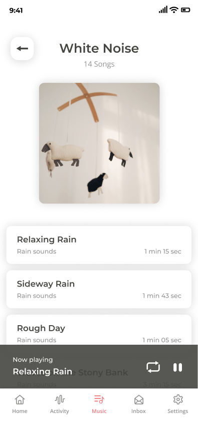
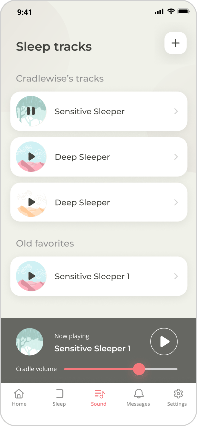
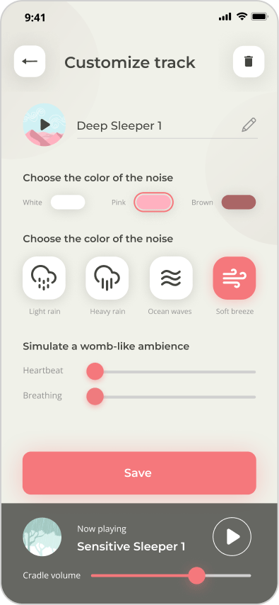
Sleep Tracks
Problem: The original audio playlist was confusing with vague options.
// This feature was crucial to Cradlewise’s value proposition as an all-in-one crib, reducing the need for an external sound machine.
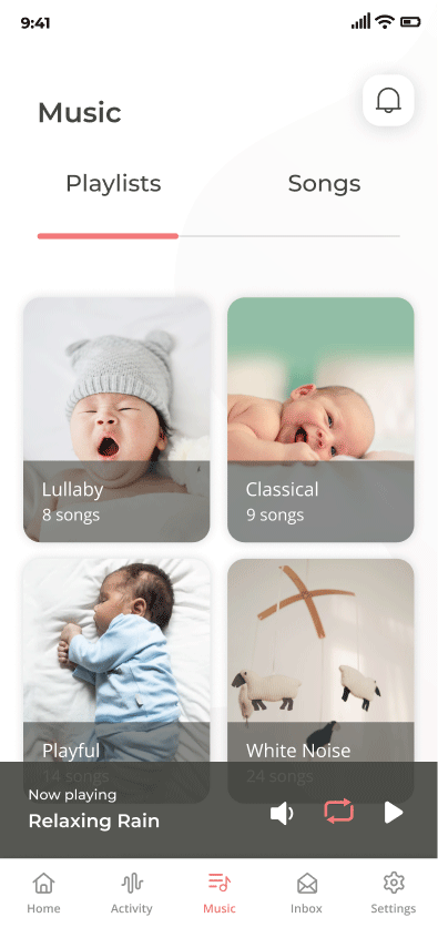
Solution: We created a curated list of calming sounds, allowing parents to customize tracks as they learn their baby's preferences. Options included pink, brown, and white noise, as well as nature sounds and heartbeat tracks for a womb-like ambience. My teammate, Misha Soni handled the UI design.
Earlier version
Revised version
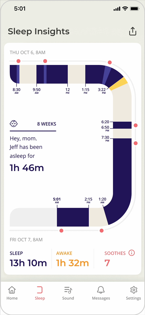
Sleep Insights
Problem: The previous version was hard to understand and didn’t provide relevant insights.
// My key contribution was highlighting how often the crib soothed the baby back to sleep with red dots, which helped build parents’ trust in our product.
Solution: Collaborating with UX designer Agustín Schelstraete and our Chief Experience Officer, I redesigned this feature for better usability based on user research. I focused on UI design, visualizing complex data clearly and changing the color scheme to dark blue and purple for intuitive understanding.
Earlier version
Revised version
Inbox
Problem: Parents received too many mixed notifications (20-60 alerts in ten hours), leading to frustration.
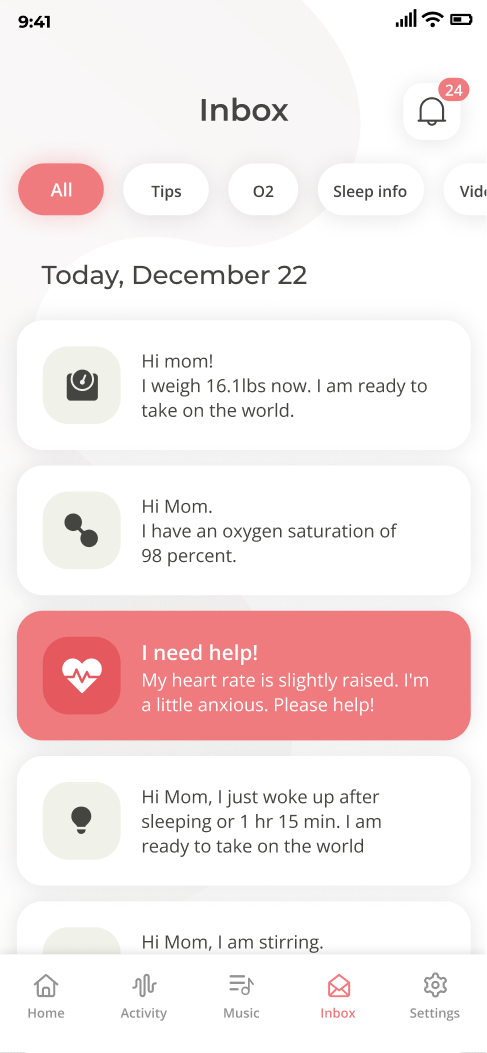
Solution: I categorized notifications into baby-related and product-related alerts, establishing a clearer hierarchy and organizing when each type would ping or push-notify.
Earlier version
Revised version

Dark Mode
Problem: Eye strain during nighttime use was a common issue; dark mode was highly requested.
// It was rewarding to see how this simple change improved user experience during those challenging 3 a.m. wake-ups. The incorporation of the purple and midnight tones, inspired from my illustrations for the Cradlewise blog, into the company's visual style guide further solidified the app's aesthetic alignment with Cradlewise's brand identity.


Solution: I implemented a dark mode based on user feedback, analyzing acclaimed apps with dark themes and adhering to accessibility guidelines.
Home screen: Light to dark mode
Blog illustrations inspiring the dark mode
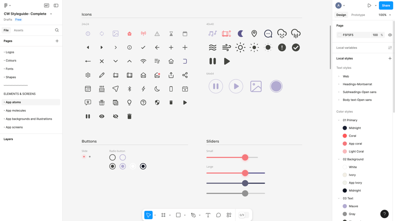
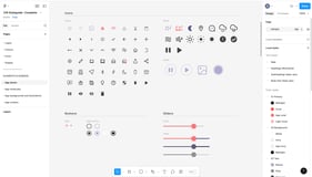
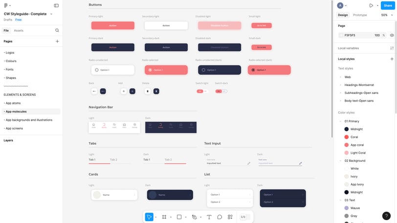
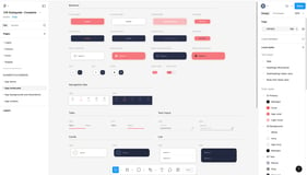
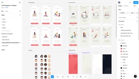
Design System
Problem: The app had inconsistent UI elements.
// Over three years, our style guide evolved alongside the product. The design system greatly improved collaboration between design, engineering, and product teams.
Solution: I developed a comprehensive design system using Atomic Design Methodology with my teammate to ensure visual consistency and brand alignment, emphasizing warmth and empathy through a cohesive set of icons and illustrations.

Achievements
Implemented a Design Process: Introduced structure to the design workflow, enhancing visibility and emphasizing the importance of design within the team.
// My experience at Cradlewise transformed me into a multidisciplinary designer and inspired me to pursue a master’s in UX design. The impact of storytelling and user advocacy on defining our brand tone, marketing strategy, and garnering positive reviews motivated me to further develop my skills and contribute more effectively within a tech-driven culture.
“To me, Cradlewise was a full system—it was everything in one. It addressed all of the issues that I was worried about in one beautiful package. It’s got a monitor, and it’s got a really smart app that I love. I can be anywhere, and I can check in, change the intensity, change the music, listen to her live, or watch her live from anywhere. And I love that it has customizable music. This just seems like the smartest thing to get because you have the motion, you have the sound, and you have the monitor.”
— A Cradlewise Parent
Improved User-Centeredness: Transitioned from intuition-based design to a research-driven approach. With an in-house design team, we actively conducted UX research and usability testing for new projects.
Design System and Style Guide: Established a design style guide that ensured consistency across the app and helped the engineering and product teams understand our component choices.
Positive User Feedback: Led significant improvements based on user feedback, resulting in better product ratings, a favorable Wirecutter review, and increased sales.
Impact
Cradlewise gives parents back an average of two hours of sleep per night, totaling 90 extra nights of sleep each year.
Won TIME's Best Inventions Award in 2020 and received recognition at CES in 2020 and 2021.
Earned an honorable mention in Fast Company's Next Big Things in Tech Awards.
Expanded shipping across the US by the end of 2022.
Clocked over 1 million hours slept in the crib by 2023.