Bridge
UX DESIGN MASTER’S CAPSTONE PROJECT
15 weeks, Individual effort


Overview
Bridge is an all-in-one medical app I designed as a 15-week capstone project for my Master’s degree. This personalized and customizable platform aims to meet diverse healthcare needs through a patient-centered care approach, empowering users to take control of their health journeys while navigating a complex healthcare system.
// Starting in September 2024, my challenge was to create a research-driven, user-focused functioning prototype with an engaging visual design within a limited timeframe.
// My thought process and reflections will be in this format.
VALIDATE
Where It All Began
Many individuals, especially those with limited health literacy or complex needs, struggle to navigate the healthcare system. Existing frameworks often prioritize care delivery over patient-centric approaches, resulting in significant healthcare inequalities.
// Addressing these challenges could also reduce business costs associated with inefficient care delivery, which can burden healthcare systems.
// Having moved to the U.S. from India in August 2023, I had to quickly familiarize myself with a new healthcare system due to a chronic health condition. As an international student with limited financial resources, my experiences managing my health—alongside similar concerns expressed by many around me—nudged me to understand these challenges deeply, and explore improving the healthcare journey through a patient-centered user experience.
The Challenge
Design Hypothesis
A patient-centered digital health platform can empower individuals to effectively manage their health, enhance communication with providers, and improve health literacy—ultimately reducing healthcare disparities.
Design Process
Secondary Research
User Research
Market Research
Discover


Define
User Personas
Stakeholders
Synthesize
Process Map
Feature Prioritization
Competitive Analysis
Design
Wireframes
User Feedback
Graphic Themes
High-Fidelity Prototypes
Validate
User Testing
Discover
I conducted secondary, primary, and market research to gain insights into the U.S. healthcare system. This research focused on defining the problem more clearly, understanding user needs and aspirations, exploring pain points, examining aspects of patient-centered care, and identifying business needs.
// During this phase, my challenge was to avoid early solutionizing and ideation. I aimed to keep an open mind while gathering valuable insights to develop a deeper understanding of the problem. Despite the short project timeline, I prioritized thoroughness to create a meaningful and relevant product.
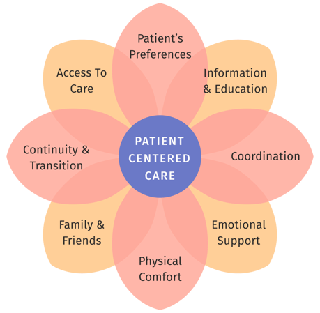
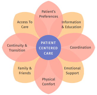
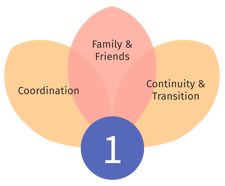
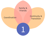
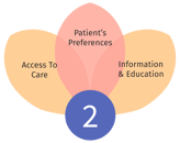
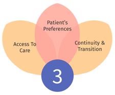
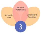
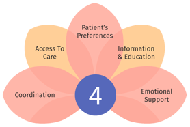
Diagram illustrating the eight dimensions of patient-centered care (Picker Institute)
Key Research Findings
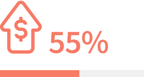
of Americans cite high out-of-pocket healthcare costs as a barrier to treatment. (Link to survey ↗)
"I need an annual check-up but I don’t have insurance. I can’t afford it."

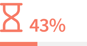


of adults postponed medical care due to feeling overwhelmed by the healthcare system. (Link to report ↗)
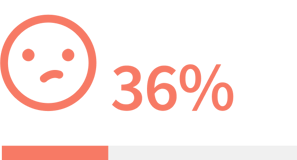
of adults report difficulty understanding medical instructions, highlighting significant struggles with health literacy. (Link to report ↗)
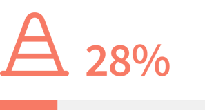
of non-elderly adults reported access barriers beyond cost, such as appointment availability or transportation issues. (Link to survey ↗)
— A recent graduate
“I have been here eleven years and haven’t gone to a doctor. I don’t even know how.”
— An immigrant working professional
“People often don’t know when care is needed.”
— A family NP
“I would need to take a day off at work to see a doctor.”
— A working professional
Define
Building on the findings from the Discover phase, I identified a list of potential stakeholders and conducted a detailed study of ten of them to create multiple user personas. This process resulted in five typical user and five stakeholder personas, helping define key user and business needs.
// Creating multiple user personas provided me with a nuanced understanding of each user group, contributing to a more expansive user experience during the design process.
Age: 62
Diana Thompson
Typical User Groups


Profile: Retired woman living alone in a suburban area, managing multiple chronic conditions.
Goal: Maintain her independence and enjoy life.
Maria Rodriguez
Age: 45
Profile: Part-time teacher and caregiver for her elderly mother and two children.
Goal: Maintain her well-being while providing effective care for her loved ones.
Alex Rivera
Age: 28
Profile: Transgender man with a recent UTI seeking knowledgeable and respectful healthcare providers for gender-affirming care.
Marcus Johnson
Age: 35
Profile: Freelance designer living in an urban area, experiencing occasional stress and anxiety, with a family history of hypertension.
Goal: Take control of his health and well-being.
Luca (Mei) Chen
Age: 23
Profile: Chinese international graduate student adjusting to a new culture, facing language barriers and complexities within the U.S. healthcare system.
Role: Healthcare administrative assistant responsible for scheduling appointments and providing patient information.
Jessica Brown
Stakeholders


Need: Requires access to accurate and up-to-date patient information.
Dr Emily Chen
Role: General practitioner providing primary care to a diverse patient population.
Need: Faces challenges in coordinating care with specialists and other healthcare providers.
Samantha Jones
Role: Lab technician in a busy diagnostic center handling high volumes of tests.
Need: Experiences lack of communication with ordering physicians regarding patient health information.
Alex Garcia
Role: Pharmacist in a community pharmacy aiming to provide personalized care.
Need: Aspires to improve patient outcomes through effective communication.
David Raupp
Role: Insurance adjuster reviewing and processing medical claims.
Need: Wants to understand the impact of coverage decisions on patient outcomes and business goals.
Synthesize
To synthesize the research findings and user personas, I created a detailed process map that provided solid insights to guide the development of early prototypes and prioritize essential features for the product. This mapping process helped uncover the structure, processes, and interactions among each stakeholder involved in the healthcare journey.
// This phase presented a unique challenge, as different user personas have distinct healthcare journeys. However, visualizing these details in a process map revealed important overlaps and repetitions—such as patient registration, medical history collection, and health record updates—allowing me to streamline the design process.
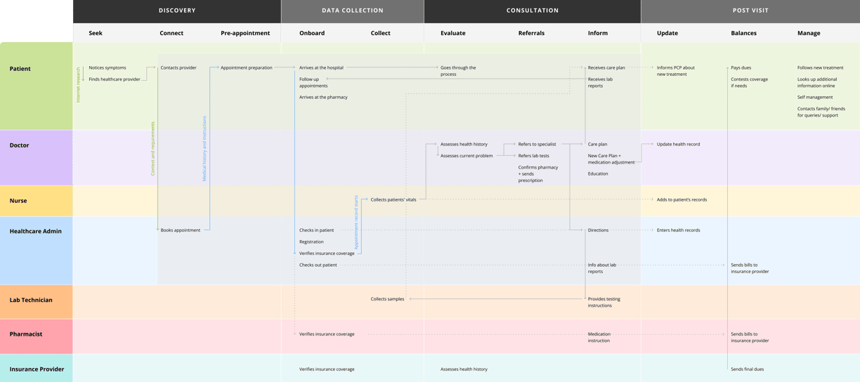
A shared health record designed to improve care coordination, reduce redundant tests, and enhance the overall patient experience.
Consolidated Health Record and Coordination Platform
Opportunities Identified


Business Impact: Reduced redundant tests can lower healthcare costs for providers significantly.
Patient-Centric Information and Self-Management Hub
A personalized platform that allows users to manage their health, track symptoms, and communicate effectively with healthcare providers.
Inclusive Healthcare Provider Directory
A directory featuring culturally competent and inclusive healthcare providers to ensure diverse patient needs are met.
Supportive Technology with Human Touch
Combining technology with human interaction to deliver personalized care experiences.
Financial Transparency and Support
Providing clear financial information and resources to help patients navigate healthcare costs effectively.
The insights gained from the process map informed the following features for Bridge.
// Some opportunities overlapped, leading me to combine related features for clarity. To prioritize these features, I ranked them based on their potential impact on patients and utilized a triangulation of time, budget, and scope to guide the development of prototypes.
Design
The design phase involved progressing from initial sketches to wireframes and finally to high-fidelity prototypes. Each iteration was reviewed by my project advisor and four volunteers, whose feedback informed key improvements.
// I ensured that all key discoveries and user insights guided the design process while incorporating feedback to avoid tunnel vision.
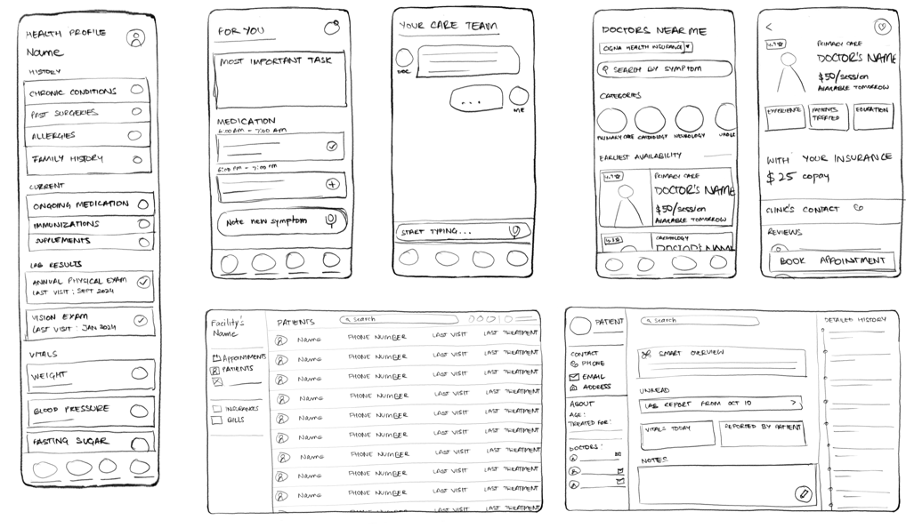
Initial sketches
Key user flows:
Personalized experience: Patients define their healthcare needs to receive tailored support and information.
Actionable tasks: Patients are given tasks based on their goals, such as managing blood sugar, scheduling check-ups, or setting health improvement goals.
Health records: Patients can compile, view, and share health records with providers or family members for better communication.
Verified information: An in-built AI assistant helps patients log symptoms, learn about care options, and access trustworthy health information.
Provider search: Patients can search for providers based on location, availability, insurance coverage, and cultural competency.
Provider portal: Providers can access patient summaries, condition updates, and messages generated by the app.
// While the provider experience is closely tied to the patient experience, I chose not to focus on the provider’s portal due to time constraints. This aspect remains a significant part of the future roadmap.
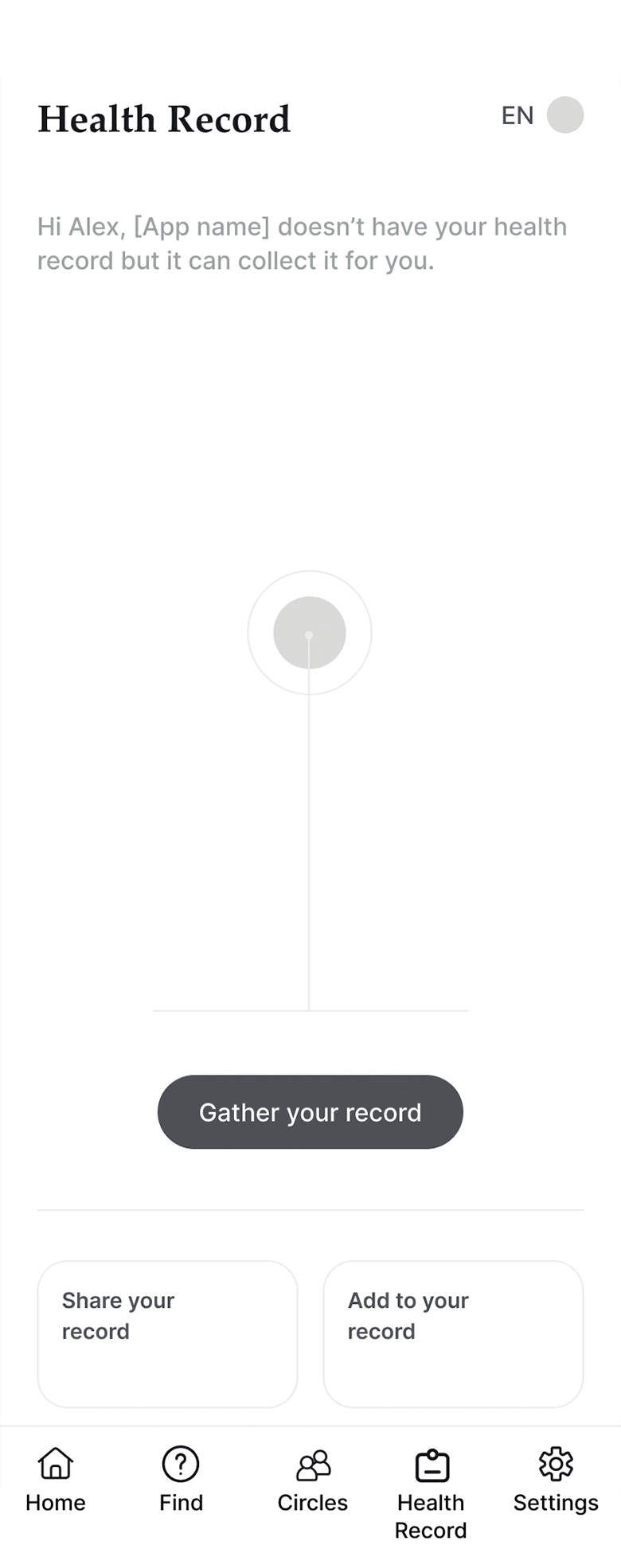
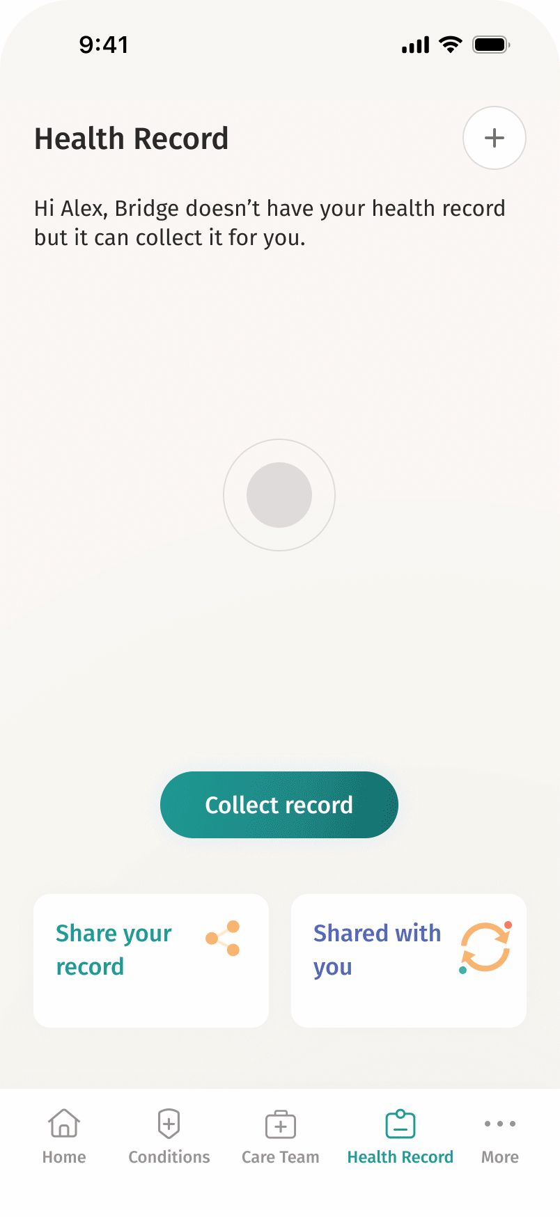
Health Record Wireframe
A shareable health record consolidates medical information from various databases. Patients can upload documents and sync updates with current or new providers.
// User feedback highlighted frustrations with losing medical records during provider transitions, which inspired this feature.

Home Page Wireframes
Four distinct home page designs were created based on different user scenarios:
// User feedback highlighted the importance of personalized experiences based on varying needs.
Patient with chronic conditions
Caregiver managing multiple dependents
Patient with a new condition seeking support
User focused on improving general health


Providers Directory Wireframe
A searchable directory allows patients to filter providers by location, availability, insurance coverage, and cultural competency. Upfront pricing helps patients make informed decisions.
// This feature builds on existing healthcare directories but focuses on improving transparency and inclusivity.


Communicating Wireframe
An AI assistant helps patients— understand symptom severity, access care options efficiently, improve health literacy through contextualized recommendations.
// Additional details were incorporated into the final prototypes based on user feedback.


Selected theme
Graphic Style
I explored three graphic themes and selected one for its simplicity, clarity, and warm tone. The design emphasizes legibility and a clear information hierarchy while maintaining a friendly aesthetic that reflects the app's philosophy.
// This theme received positive responses during testing for its clean design and approachable style.

Other themes


Branding Insight
I named the app "Bridge" to symbolize its role in bridging healthcare gaps. The logo features an eight-petalled flower representing eight facets of patient-centered care while also nodding to healing traditions.
Prototypes
Here are high-fidelity interactive prototypes available for exploration. The interactive flows are organized based on use cases: chronic condition management, new user onboarding, caregiver support, and health improvement strategies.
// This phase was challenging due to overlapping functionalities across different use cases alongside limitations in Figma's prototyping features.
Onboarding
Final screens

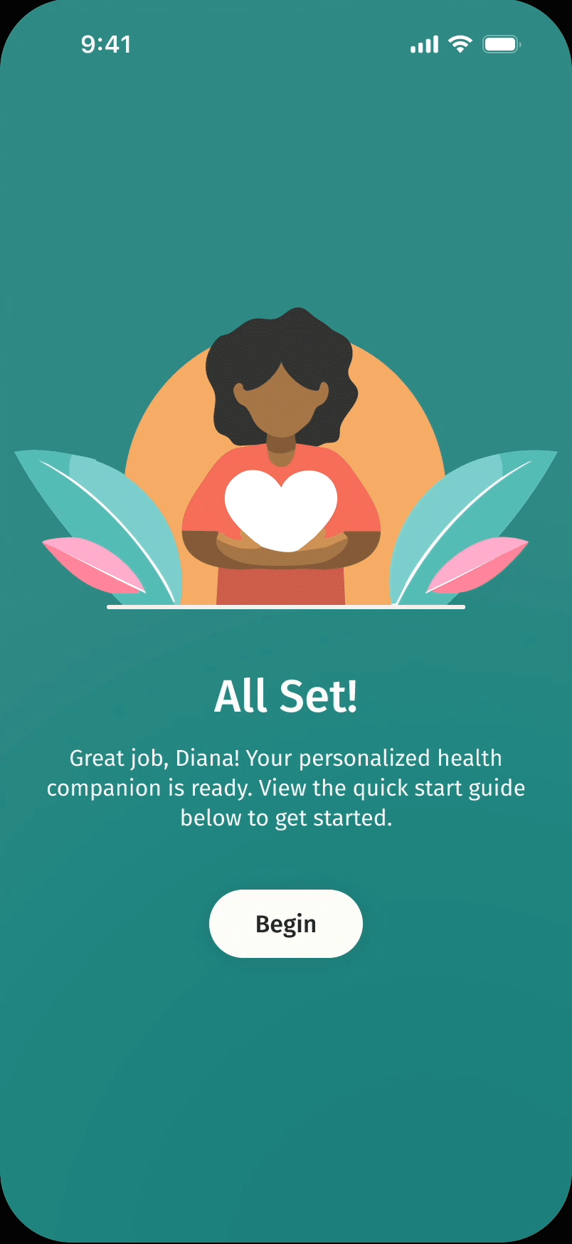


Splash screen
Home-Ongoing conditions
Home-Caregiver
Intelligent communication


Care team
Health record
Share record
Validate
Bridge has received overwhelmingly positive feedback from users who reviewed the prototypes. To further validate all design decisions, I aim to conduct larger-scale usability tests to assess ease of use, performance against expectations, and effectiveness in accomplishing user goals.
// As a self-funded project, I am actively exploring free tools or partnerships for larger-scale testing. If you have recommendations, please reach out to me at aditi.kovidadt@gmail.com. Quantitative data would greatly enhance my portfolio and provide valuable insights during the hiring process.
Positive user feedback indicates a strong likelihood of adoption, which can lead to improved patient retention rates.
“This would solve many problems when it comes to dealing with healthcare. I think the sharing of records is the coolest part. This (Bridge) is realistic.”
— A licensed therapist
“It’s like this was designed specifically for me.”
— An international student
What's Next
Due to the project's tight timeline, I had to deprioritize several goals, primarily related to payment assistance and the interlinked healthcare provider portal. Other areas for future exploration include accessibility features, customizable goals for progress tracking, and detailed self-management tools.
// Future enhancements like payment assistance and a provider portal will not only improve user experience but also drive revenue through increased service utilization.
Working on Bridge has been a rewarding experience that allowed me to tackle a complex challenge through thoughtful design. I prioritized creating a functional concept grounded in user insights while balancing time constraints effectively.